Natacha Steyn
→
Go Back
AKAD
Project @ DEPT
Break normal. Learn different.
Not just a claim, but an attitude.
My Role Lead Designer & Art Director
TEAM @ DEPT®
Giulio Rubinelli, Johannes Klein, Leah Kruse, Iris Claus, Hana Puljić Bohač, Nicolas Zachara, Sönke Schürmeier.
Services
Art & Concept, Brand Identity, Activation, Media
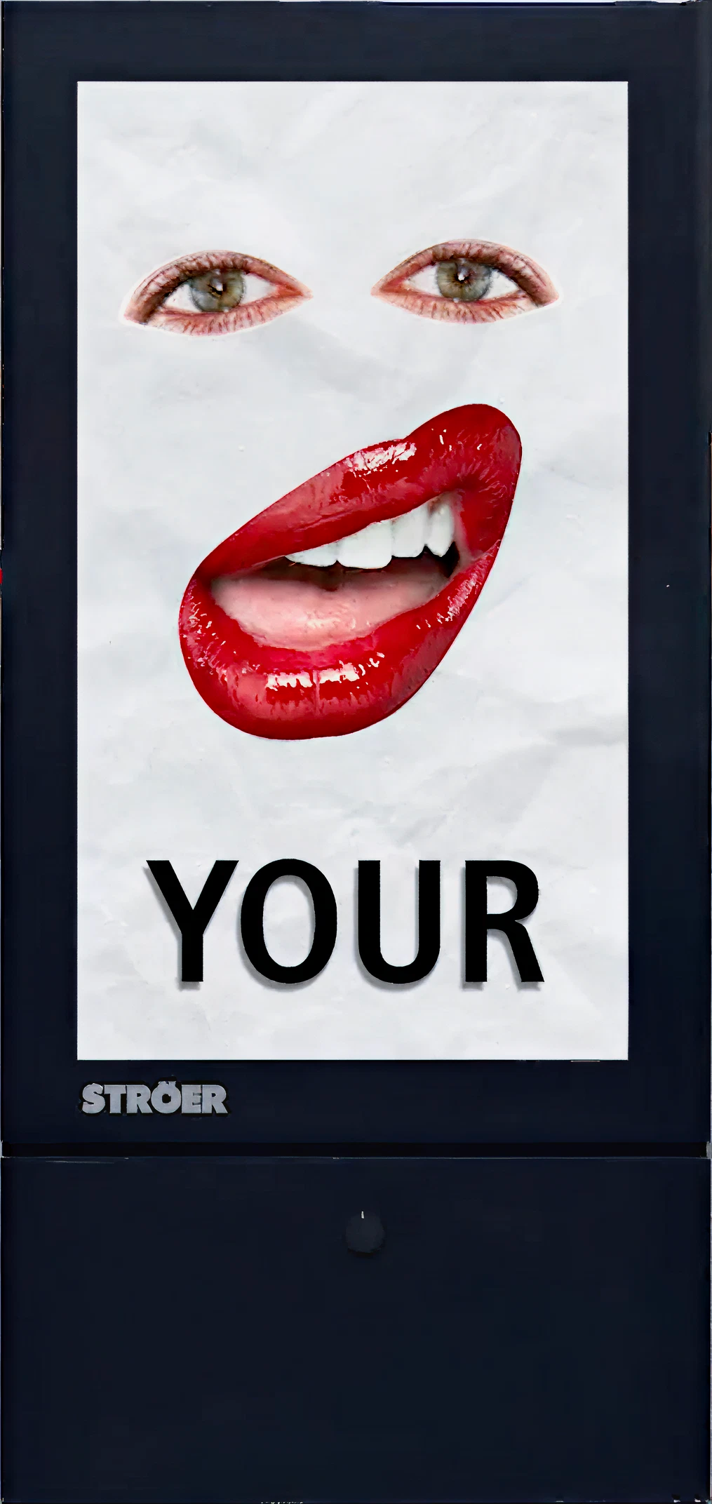

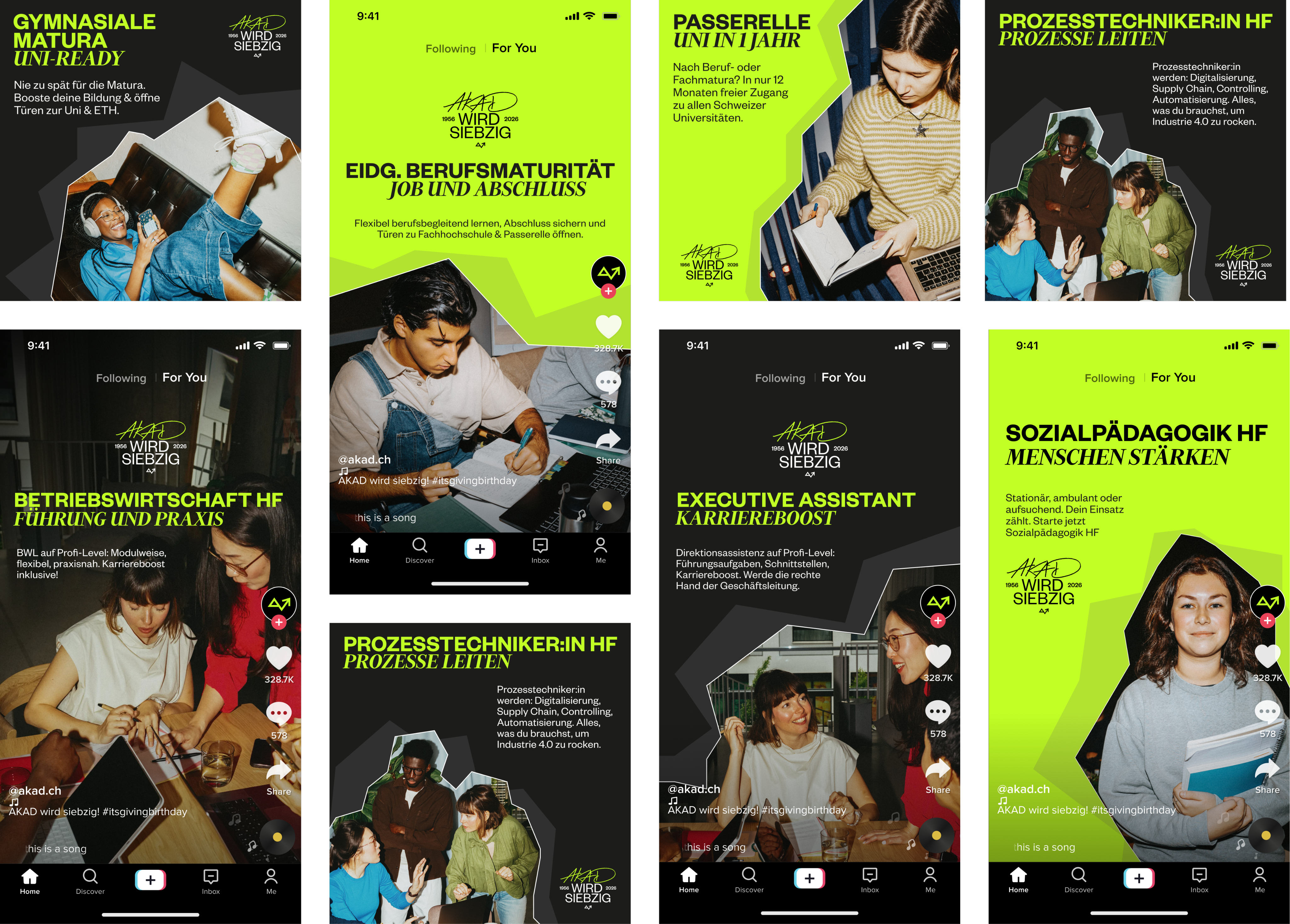
A campaign where we aim to break the rules. As a team we framed a few important questions that brings us back to our student day, what do we miss, what stood out, what was life like... Right there, the visual language got inspired by sourcing images that genuinely reflects the student lifestyle. Introducing flash, analogue style imagery, giving this authentic raw and nostalgic touch as if capturing this realness of student life.
AKAD is turning
70 years old!
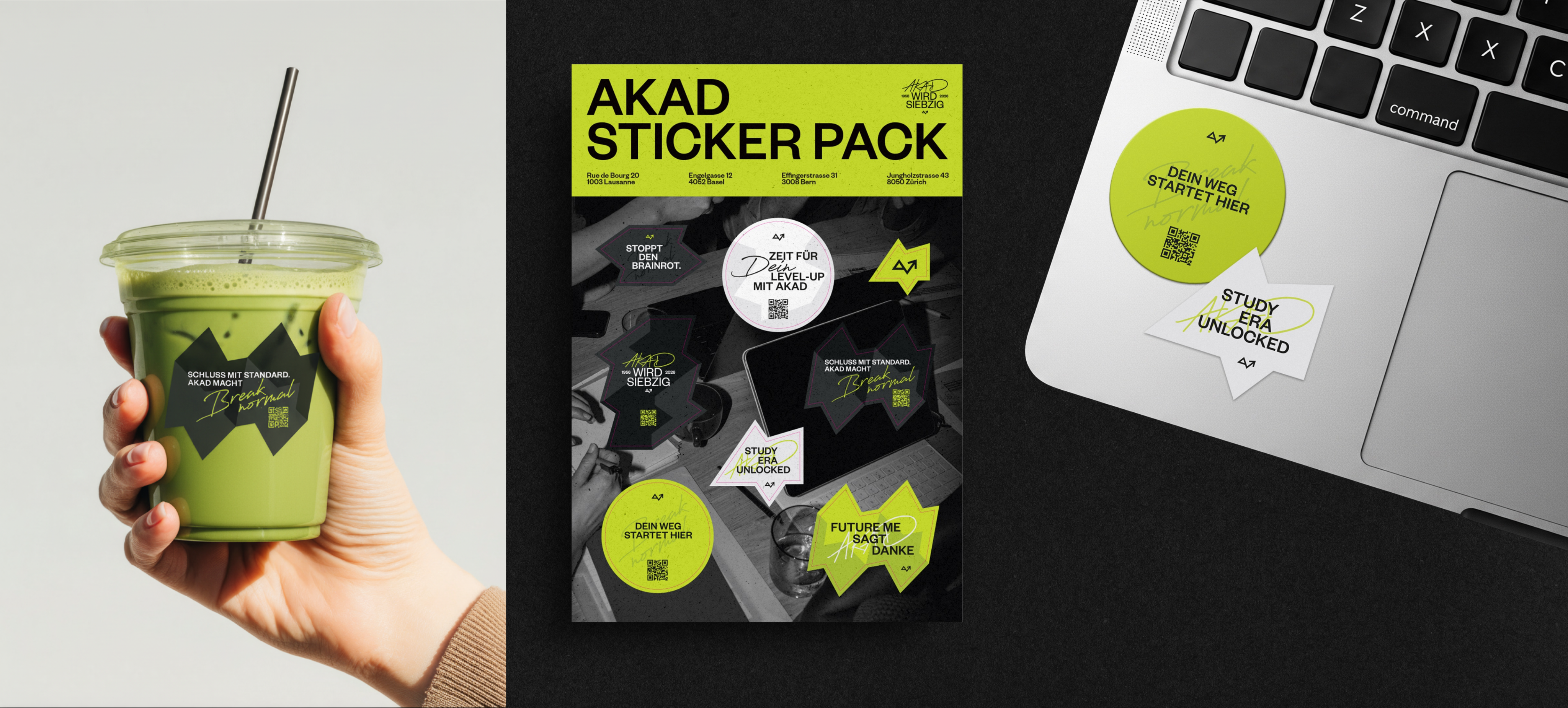
DEPT got the opportunity to take the creative lead in shaping their identity for their 70 Years Campaign. The Art Direction is inspired by the personal journey of a student’s life. Thus we wanted to add a handwritten, personal touch to the whole identity of the 70 years campaign, representing the YOU in your study journey at AKAD.
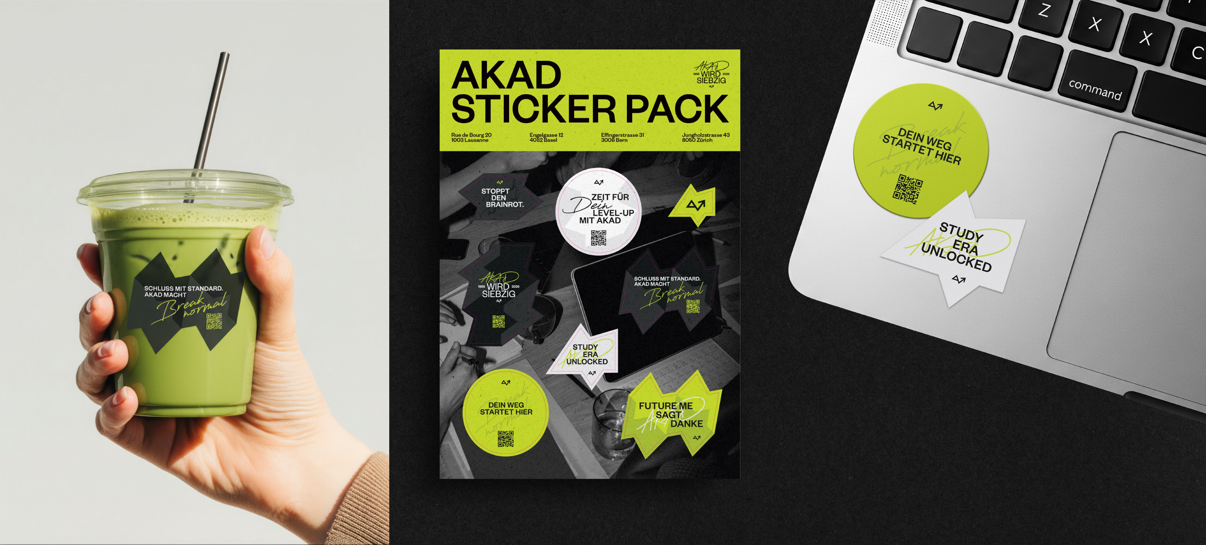
The message flows through a multi-channel campaign, on evolving non-stop into various compositions to expand to a wider range of assets.
70 Years. Zero interest in staying normal.
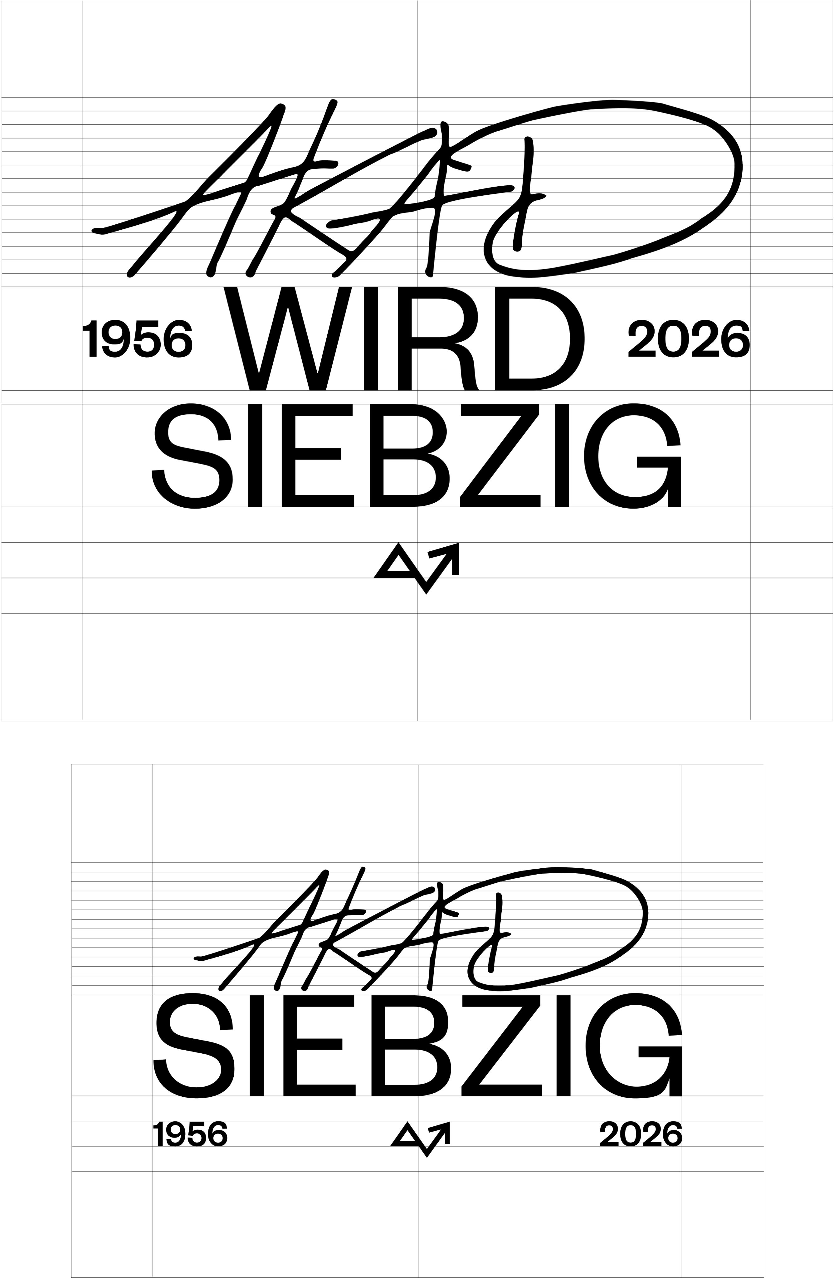
The concept outlines the strategy for AKAD’s 70th anniversary campaign, including the launch of a new logo that captures the spirit of the message: “70 Years. Zero interest in staying normal.”
The art direction draws strong inspiration from 1950s Swiss visual culture, particularly the International Typographic Style (Swiss Design). It also references the photography of Karlheinz Weinberger, who documented the rebellious youth subcultures of the 1950s. This influence brings a sense of authenticity and free-spirited energy to the visual language of the campaign.
To balance these references, we combined the timeless clarity of Swiss design with a more personal, handwritten touch. This contrast introduces a subtle “breaking-normal” feeling within the otherwise geometric and structured design language.
We also reimagined the number 70 by writing it out as “siebzig.” In its written form, the number becomes more expressive and visually distinctive, reinforcing the campaign’s idea of doing things a little differently.
Finally, geometric elements subtly echo the triangular form of the original AKAD logo, tying the new design back to the brand’s visual heritage.
The result is an anniversary logo that celebrates 70 years while staying true to AKAD’s core attitude—bold, unconventional, and always a little outside the norm.

more Projects

Eeva Ria
→
JBL
→
Brother
→
Blaek
→
Asics
→
Athco
→

CONTACT
steyn.natacha@gmail.com
SOCIAL
→
Go Back
AKAD
Project @ DEPT
Break normal. Learn different. Not just a claim, but an attitude.
My Role Lead Designer & Art Director
TEAM @ DEPT®
Giulio Rubinelli, Johannes Klein, Leah Kruse, Iris Claus, Hana Puljić Bohač, Nicolas Zachara, Sönke Schürmeier.
Services
Art & Concept, Brand Identity, Activation, Media
A campaign where we aim to break the rules. As a team we framed a few important questions that brings us back to our student day, what do we miss, what stood out, what was life like... Right there, the visual language got inspired by sourcing images that genuinely reflects the student lifestyle. Introducing flash, analogue style imagery, giving this authentic raw and nostalgic touch as if capturing this realness of student life.
AKAD is turning
70 years old!
DEPT got the opportunity to take the creative lead in shaping their identity for their 70 Years Campaign. The Art Direction is inspired by the personal journey of a student’s life. Thus we wanted to add a handwritten, personal touch to the whole identity of the 70 years campaign, representing the YOU in your study journey at AKAD.
The message flows through a multi-channel campaign, on evolving non-stop into various compositions to expand to a wider range of assets.
70 Years. Zero interest in staying normal.
The concept outlines the strategy for AKAD’s 70th anniversary campaign, including the launch of a new logo that captures the spirit of the message: “70 Years. Zero interest in staying normal.”
The art direction draws strong inspiration from 1950s Swiss visual culture, particularly the International Typographic Style (Swiss Design). It also references the photography of Karlheinz Weinberger, who documented the rebellious youth subcultures of the 1950s. This influence brings a sense of authenticity and free-spirited energy to the visual language of the campaign.
To balance these references, we combined the timeless clarity of Swiss design with a more personal, handwritten touch. This contrast introduces a subtle “breaking-normal” feeling within the otherwise geometric and structured design language.
We also reimagined the number 70 by writing it out as “siebzig.” In its written form, the number becomes more expressive and visually distinctive, reinforcing the campaign’s idea of doing things a little differently.
Finally, geometric elements subtly echo the triangular form of the original AKAD logo, tying the new design back to the brand’s visual heritage.
The result is an anniversary logo that celebrates 70 years while staying true to AKAD’s core attitude—bold, unconventional, and always a little outside the norm.

more Projects
Eeva Ria
→
JBL
→
Brother
→
Blaek
→
Asics
→
Athco
→

CONTACT
SOCIAL
Natacha Steyn
→
Go Back
AKAD
Project @ DEPT
Break normal.
Learn different.
Not just a claim,
but an attitude.
My Role Lead Designer & Art Director
TEAM @ DEPT®
Giulio Rubinelli, Johannes Klein, Leah Kruse, Iris Claus, Hana Puljić Bohač, Nicolas Zachara, Sönke Schürmeier.
Services
Art & Concept, Brand Identity, Activation, Media
A campaign where we aim to break the rules. As a team we framed a few important questions that brings us back to our student day, what do we miss, what stood out, what was life like... Right there, the visual language got inspired by sourcing images that genuinely reflects the student lifestyle. Introducing flash, analogue style imagery, giving this authentic raw and nostalgic touch as if capturing this realness of student life.
AKAD is turning
70 years old!
DEPT got the opportunity to take the creative lead in shaping their identity for their 70 Years Campaign. The Art Direction is inspired by the personal journey of a student’s life. Thus we wanted to add a handwritten, personal touch to the whole identity of the 70 years campaign, representing the YOU in your study journey at AKAD.
The message flows through a multi-channel campaign, on evolving non-stop into various compositions to expand to a wider range of assets.
70 Years. Zero interest in staying normal.
The concept outlines the strategy for AKAD’s 70th anniversary campaign, including the launch of a new logo that captures the spirit of the message: “70 Years. Zero interest in staying normal.”
The art direction draws strong inspiration from 1950s Swiss visual culture, particularly the International Typographic Style (Swiss Design). It also references the photography of Karlheinz Weinberger, who documented the rebellious youth subcultures of the 1950s. This influence brings a sense of authenticity and free-spirited energy to the visual language of the campaign.
To balance these references, we combined the timeless clarity of Swiss design with a more personal, handwritten touch. This contrast introduces a subtle “breaking-normal” feeling within the otherwise geometric and structured design language.
We also reimagined the number 70 by writing it out as “siebzig.” In its written form, the number becomes more expressive and visually distinctive, reinforcing the campaign’s idea of doing things a little differently.
Finally, geometric elements subtly echo the triangular form of the original AKAD logo, tying the new design back to the brand’s visual heritage.
The result is an anniversary logo that celebrates 70 years while staying true to AKAD’s core attitude—bold, unconventional, and always a little outside the norm.

more Projects
Eeva Ria
→
JBL
→
Brother
→
Blaek
→
Asics
→
Athco
→

CONTACT
steyn.natacha@gmail.com
SOCIAL